Columns
The Columns (two) and Columns (three) media items give you more layout options for your content.
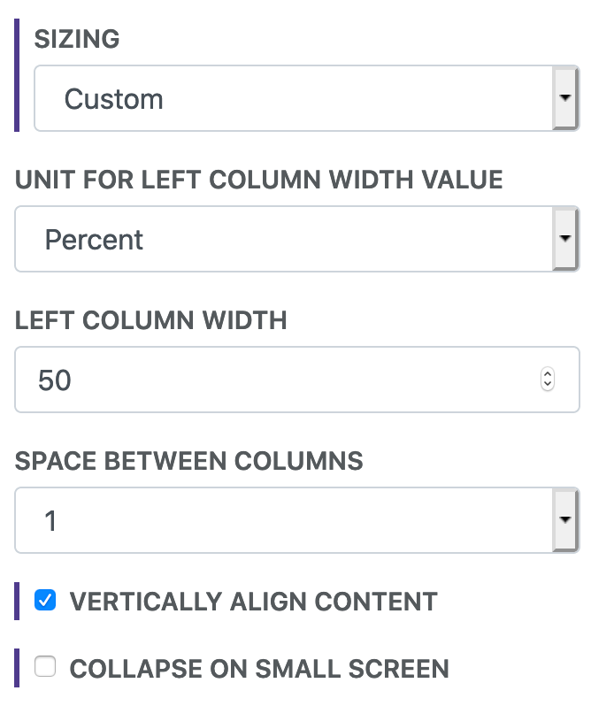
Options
Vertically Align Content
Columns contents are aligned at the top by default. This option will align all contents of the columns vertically. If it looks like they are not properly aligned then check for empty lines and elements with invisible margin or padding.
Sizing
By default the columns are of equal width. Sizing allows you to customize the widths.
Space Between Columns
This option allows you to change the amount of space between the columns.
Collapse on Small Screen
Often times the content in columns will get too squished on small screens. By default the columns stack on top of each other on smaller screens. Unchecking this will maintain the column layout.
Box Styling
With the box styling, you can easily change the background colors and font colors of the columns. You can also change the padding around the content.
Examples
How is this done?[1]
Getting Creative
The Columns media items give you a lot of flexibility for arranging your content. Try mixing them with other media items like the Content Box.
If you're using the columns to arrange other media items with each other then you might consider using the Flex Container media item. It will give more control and flexibility around arrangement and responsive design for various screen sizes.
This Columns (Two) media item has a larger left column with right-aligned text content and a full-width image in the right column. The content is vertically aligned. Collapsing and stacking the columns on small screens is disabled to maintain the style.