Navbar
The Navbar media item allows you to put a custom navbar in your content. It can be used for navigation to other pages in the Pagedip, external URLs, or to specific locations on the current page.
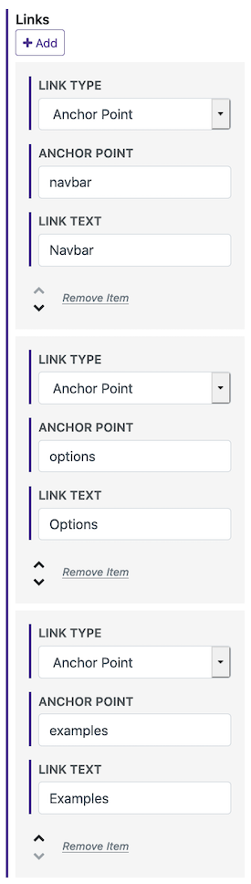
This first example has links to anchor points on this page. How is this done?[1]
Options
Links - The links to show in the navbar.
Link Type - Can be a page from this Pagedip, URL, or anchor point on the page.
Anchor Point - If the link is to a page in this Pagedip, then this link will go directly to that point on the page. If you're linking to an anchor point on the current page, then it will scroll to that point on this page.
Link Text - The text displayed for the link in the navbar. If it's a page then it'll default to the page's title.
Styling - Customize the looks of the navbar.
Background Color
Font Color
Active/Hover Font Color - The link color for the active page and when hovering over the link.
Font Size
Font Weight
Alignment - Left, right, or center.
Breakpoint - This sets the screen size at which the links are placed under a menu button. If you have many links that you'll likely need to use a larger size, or if you have a few links then you can likely use a small size.
Examples
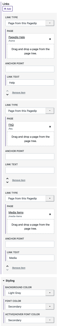
This navbar links to other pages in this Pagedip. The colors are customized, using the theme color palette's lightgray for the background and the secondary brand color for the links. How is this done?[2]
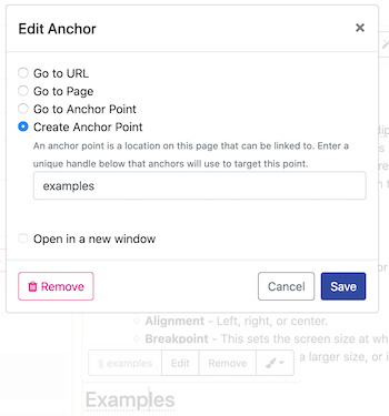
First we'll create anchor points on the page. This is done by selecting text and creating a hyperlink. In the hyperlink options, choose "Create Anchor Point".
When creating the navbar, we'll make links using the Anchor Point link type. We'll match the name of the anchor point we created here with the navbar link's anchor point option.
For the links in this navbar, we'll use the link type for pages from this Pagedip. To change the colors, we'll go into the styling section and modify the options there.