Tab-It
The Tab-It media template creates a fun and interactive way to present data to your readers.
Basic Example
Composition
A Tab-It media item is composed with two different media templates. The Tab-It media template is the parent and it will contain a list of children Tab-It Item media items.
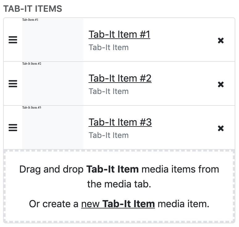
The list of Tab-It Items is managed in the options for the Tab-It.
To add a Tab-It Item to the Tab-It, you can either drag and drop an existing one from the media tab or click the link that says "Or create a new Tab-It Item".
Tab-It Options
Tab-It Items - The list of children Tab-It Items. The items can be added, removed, and reordered.
Tab-It Style - There are two options, Blocks and Tabs. The default option is Blocks which has a more angular look and separation between the tabs and the content. The Tabs option gives rounded edges and connects the content with the tabs.
Active Header Options - Set the styling for the active tab.
In-Active Header Options - Set the styling for the in-active tabs.
Content Settings - Set the styling of the tab contents.
Tab-It Item Options
Header Type - the Icon and Title option is used for a simple text and icon. The Content Field is used if you need to do anything fancier.
Title - the text displayed in the tab header.
Icon - a Font Awesome icon.
Icon Type - the type of Font Awesome icon.
Style Overrides - here you can set custom styling for the individual tabs. This will override the styling provided by the parent Tab-It.