Color Palette
Last updated a few seconds ago
The global color palette connects the Pagedip with your branding. The colors set here will be used throughout the entire Pagedip.
We've used a small selection of options that generally covers all the color styling needs. The smaller selection also ensures your content stays on brand and consistent in look and feel.
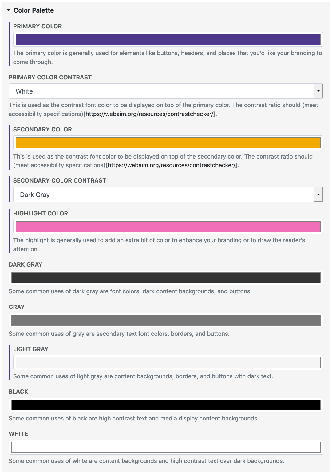
Palette Options
Primary
Secondary
Highlight
Dark Gray
Gray
Light Gray
Black
White
How the Palette is Used
The colors set by the palette are used by media items and other theme options. Some examples are font colors, button colors, interactive icons, etc.
Example
Here is the color palette selection for this Pagedip Help.